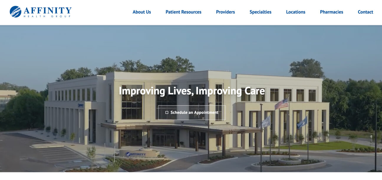
Before: Single CTA with video background (disabled on mobile)
The Problem
Our homepage hero section had issues:
- Video background caused performance problems on slower connections
- Had to disable video entirely on mobile, replacing it with a static image
- Could only accommodate one call-to-action
- Stakeholders needed to promote multiple campaigns in that prime real estate

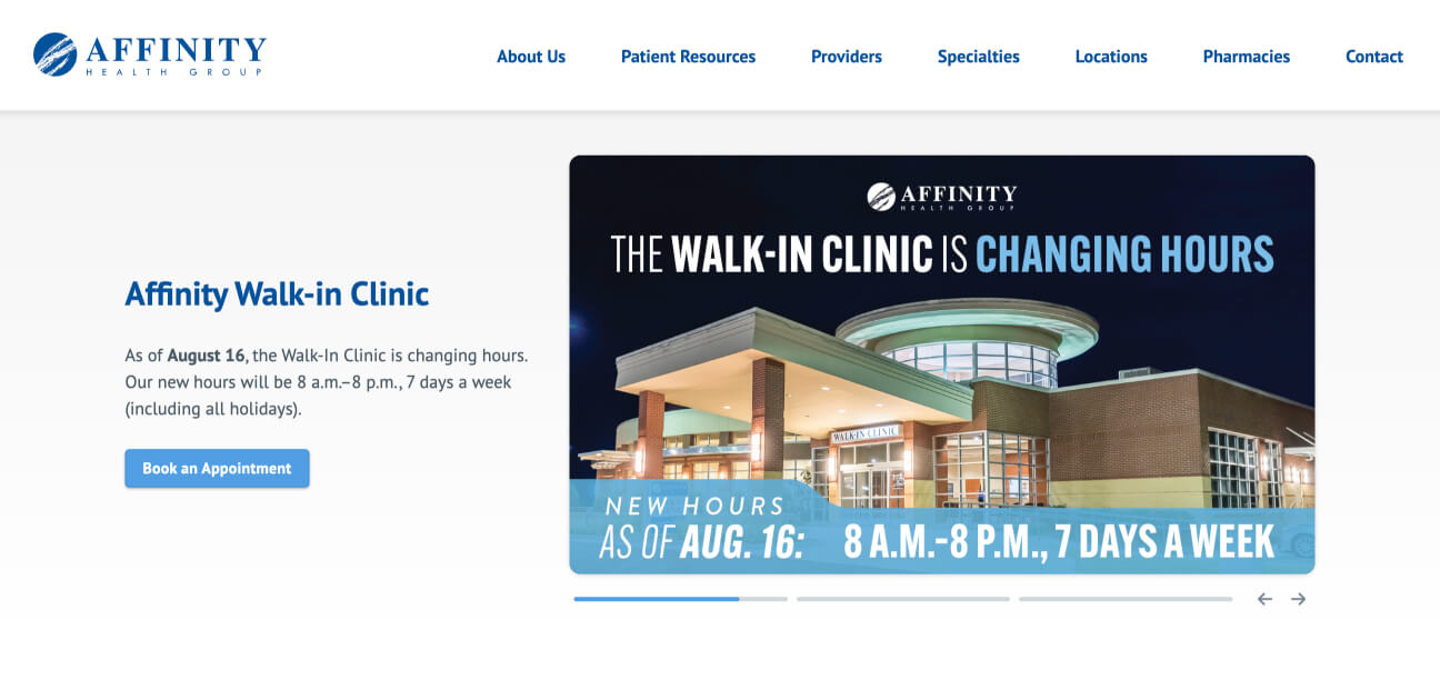
After: Multi-CTA slider with story-style navigation
What I Built
An auto-advancing slider with story-style navigation that:
- Works smoothly across all devices without performance issues
- Lets stakeholders showcase multiple CTAs in a clean interface
- Gives users control with clickable progress bars and navigation arrows
- Scales text independently from graphics for readability at any screen size
- Provides visual feedback so transitions feel intentional, not jarring
Technical Challenges
Responsive text
Separated text from graphics so it could scale properly at any screen size—embedding text in images would make it illegible on small screens or oversized on large ones
Image scaling
Used CSS aspect-ratio to let graphics resize fluidly without needing multiple image sizes or restrictive safe zones
Accessible navigation
Included arrow buttons alongside the progress bar interface for users who might not be familiar with story-style navigation (our audience includes seniors)
How This Came Together
I worked as the solo developer on a small marketing team managing three healthcare sites. When stakeholders came to me wanting multiple CTAs in the hero space, I knew the video background had to go anyway—our goals aligned perfectly.
Our team prioritized speed over lengthy design processes, so I moved straight from requirements gathering to building a working prototype in code. Once I had something functional, I walked it through with our marketing director and the broader team, then secured final approval from business owners before launching.
Results
- Eliminated performance issues across all devices
- Delivered the multi-CTA functionality stakeholders needed
- Created a seamless responsive experience from mobile to desktop
- Received zero negative user feedback (notable given our diverse age demographic)
- Got enthusiastic stakeholder approval
Note: Quantitative user metrics were not established on this legacy platform during the implementation of these updates.