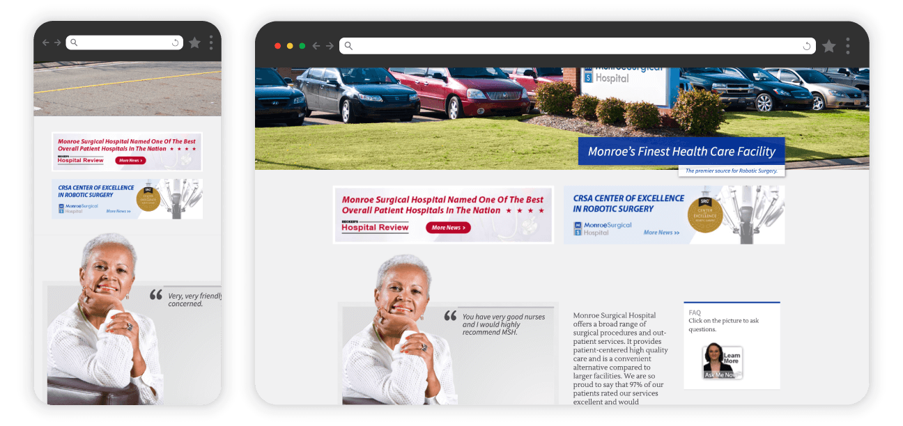
Before: Static, unresponsive content with text embedded in graphics
The Problem
Our healthcare websites had sections for news, updates, and seasonal information that were causing headaches:
- Text was embedded in graphics, making it impossible to control sizing across devices
- Graphics needed huge safe zones to prevent cropping at different screen sizes
- Maintaining and updating content was painfully slow
- The static layout didn't work well on mobile
- We needed to meet CMS accessibility standards requiring certain content to be reachable within 3 clicks

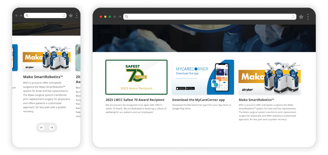
After: Touch-enabled cards with separate text and graphics
What I Built
A reusable card component library that:
- Works across all three healthcare sites with consistent behavior
- Separates text from graphics for better control and maintenance
- Responds progressively—single card on mobile, scaling to multiple cards on larger screens
- Supports both swipe gestures and navigation arrows for accessibility
- Lets us prioritize primary content while keeping secondary content accessible
- Provides direct links to important pages, helping meet CMS accessibility requirements
Technical Challenges
Building for reusability
Midway through the first implementation, I realized this needed to work across multiple sites with different structures. I standardized the JavaScript functionality, CSS styling, and HTML structure so it could drop into any site regardless of the surrounding architecture.
Balancing modern interactions with accessibility
I got pushback on having off-screen cards and swipe gestures. But the accessibility requirements meant the old approach wasn't an option. I made the case that prioritizing 1-2 cards on-screen while keeping others accessible was better than overwhelming users with vertical scrolling (some implementations had 6-7 cards). Added arrows as a clear fallback for users unfamiliar with swipe gestures, especially seniors.
Responsive graphics without safe zones
By separating text from graphics, I eliminated the need for massive safe zones. Graphics could be more visually interesting without worrying about text getting cut off at different screen sizes.
How This Came Together
As the solo developer managing three healthcare sites, I was responsible for both designing and implementing solutions. When I redesigned these sites to be responsive, the old static content sections became maintenance nightmares.
I started building the first implementation and realized halfway through that this was too complex to rebuild for each site. That's when I decided to create it as a library—standardized code that could be reused everywhere. On one site where stakeholders objected to off-screen content, we compromised with a responsive grid on desktop while keeping the single-card mobile experience.
Results
- Successfully deployed across all three healthcare properties
- Dramatically simplified graphic design and maintenance workflow
- Met CMS accessibility standards by providing direct links to priority pages
- Created a system that worked for both modern users (swipe gestures) and seniors (navigation arrows)
Note: Quantitative user metrics were not established on this legacy platform during the implementation of these updates.